Lyle Small had never tasted beer before he convinced Coors Light to let him splash its cans with a color-changing ink that forever changed the brand.
But he came to Coors’ Golden, Colo., brewery with a vision for how to supercharge a beer brand that made its bones from its association with cold. Now, 20 years after he first approached the beermaker about turning the mountains on its cans blue, “mountains are blue” has become Coors Light’s calling card and a call to action.
Small owns a small business, Chromatic Technologies, Inc. (CTI), and was raised Mormon before attending Cornell University, where he tinkered with ink, specifically thermochromic ink technology that changes color when exposed to heat or cold.
For years, CTI, which Small founded in 1993, supplied the financial services sector, while also working with sunlight-activated and glow-in-the-dark ink technologies. But thermochromic ink technologies held the most potential, Small says. “I always had a dream that a beverage company would adopt this.”
And Small, based in Colorado Springs, Colo., had one company in mind, one whose ads boasted beer as cold and refreshing as the Rocky Mountains.

In 2002, Small came knocking at Coors. Through his persistence, Small sold the beermaker on an idea that helped propel Coors Light to become the No. 2 best-selling beer in America, while transforming not only how it is packaged, but how also consumers perceive the beer through the simplest of messages: mountains are blue, beer is cold.
And in 2022, 15 years after the color-changing technology first appeared on Coors Light’s cans, the message is as relevant as ever.
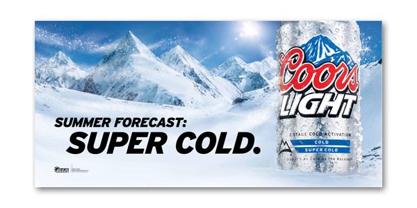
“It’s really important to Coors Light as a brand. We’re the only beer brand that’s cold lagered, cold filtered and cold packaged, so we really want to easily communicate that to consumers,” says Chris Steele, senior marketing director for Coors Light. “The blue mountains are a manifestation of our commitment to cold.”
Conquering cold
If there’s one fact that can bring beer drinkers together, it may just be that cold beer is better than warm beer.
Consumer surveys consistently show a strong preference toward cold beer. And Small recalls Coors research at the time that found a significant portion of beer drinkers said they’d had a poor experience because their beer was too warm.
A simple visual cue telling consumers their Coors Light is cold aimed to solve that problem once and for all.
“When Coors did consumer testing, (consumers would) say, ‘I know Coors cares about the experience I have with their product” because of the blue mountains, Small says.
Small thought his thermochromic ink process could help Coors Light own cold. And it dovetailed with a corporate shift that sought to do just that. When he finally got in the door, in 2004, he pitched his idea for color-changing cans in earnest. At the same time, Coors was experimenting with color-changing ink on bottle labels.
By 2006, the company invited Small to test out his color-changing ink at its Rocky Mountain Metal Container plant in Golden. There, Small spent countless hours struggling to get consistent ink application on cans as they zipped down the line at 2,000 cans a minute.
Then, on July 4, 2006, he had a “eureka” moment, discovering how he could double the color intensity of the blue mountains to make the product viable.
“That was the big breakthrough,” he says.
But Coors Light’s color-changing cans almost didn’t happen, remembers Ray Toms, a retired Molson Coors packaging engineer who helped usher the technology to market.
‘A home run’
Before Small cried “eureka,” the brand saw thermochromic ink technology as a U.S. summertime packaging promotion, but without the ability to print on both bottle labels and cans, the idea was dead in the water. Instead, bottled beer with the color-changing labels developed by LCR Hallcrest was sold in Puerto Rico, Toms says. And once company executives saw the labels in action, they wanted to bring the color-changing tech to the U.S., he says.
“That ramped up the cans,” Toms says. “It could have died right there if it weren’t for Puerto Rico launching it.”
With the ink application problem solved, the cans — the mountains would turn blue at approximately 46 degrees Fahrenheit — went into production. First in 2007 in the U.K. Then in 2008 in Canada. And they finally reached the U.S. in 2009.
The result? Within a year of launching the color-changing bottle in 2007, Coors Light surpassed Miller Lite as the country’s No. 3 best-selling beer. And by 2011, two years after introducing the tech on cans in the U.S., Coors Light overtook Budweiser as the No. 2 seller in the country, according to Beer Marketers Insights.
It was, Small says, “a home run that exceeded all of our expectations.”
‘True to the brand’
The blue mountains were a hit but weren’t without risk. Handing billions of cans over to a small business was a gamble that paid off, Small says.
“Being a pioneer holds a lot of potential, but it’s really scary,” he says. “I had no idea what I was asking of the folks at Coors. I’m suggesting they turn over a big part of their brand message to my new thing.
“The miracle of the Coors Light Rocky Mountain cold refreshment message is that a group of people at Coors got together and insisted that we had to try and make it happen.”
Toms, who worked at Molson Coors for 24 years and helped introduce packaging innovations like the Miller Lite vortex bottle, says the color-changing technology worked because it made sense for the brand.
“We had a lot of innovations, but how does it build the brand?” he says. The blue mountains did that and more.
Within a few years, Coors Light introduced a short-lived two-stage cold indicator on cans and bottles that showed it was a beer that was not just cold, but “super cold,” as well as secondary packaging that also used color-changing ink. That evolved into packaging with a window so consumers could see if the mountains on the cans were blue.
Today, Coors Light is all about providing moments of chill. It’s the beer for relaxing and recharging. But the blue mountains are never far from the heart of the brand, nor is the color-changing tech for which Small advocated so hard. Last month, the brand introduced Chill Polish, nail polish that changes from gray to blue when holding a cold beverage.
Coors Light’s blue mountains are a simple visual cue derived from a complex scientific process perfected by a persistent nerd.
And it’s become an innate part of the brand’s DNA.
“It’s very hard to find a packaging innovation that hits true to the brand. There can be gimmicky stuff, but this one had staying power,” Toms says. “That was the beauty of it.”