The skies are a bit brighter and the beer is a bit colder.
That’s the feeling Coors Light is aiming to convey with a packaging makeover debuting across the U.S. this week.
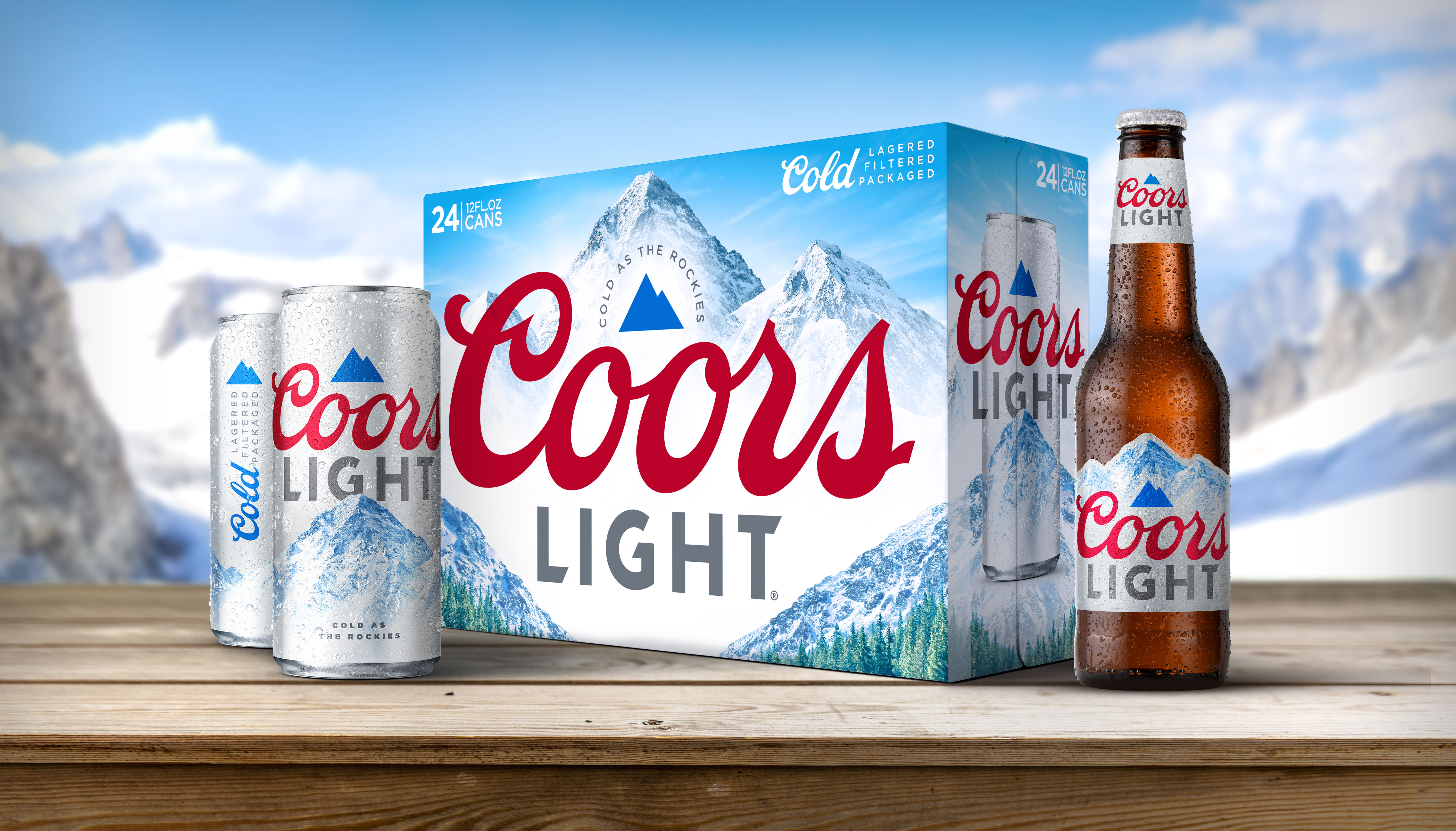
The nation’s No. 2-selling beer is out with a fresh new look, offering a sleeker and cleaner look designed to resonate with younger legal-age drinkers.
Cans and bottles now don a prominent blue mountain icon, while cases and packs now sport a resplendent mountain valley, complete with a stand of fir trees and a crisp, blue sky, boasting “Cold as the Rockies."
“We wanted a look that embodies Coors Light’s signature mountain-cold refreshment, but we also wanted it to fit with our ‘Made to Chill’ platform, which is more about finding a moment to refresh your spirit amid the pressures of everyday life,” says Ricky Gonzalez, associate marketing manager for Coors Light, referring to the brand’s tagline.
While the updated branding retains the iconic “Coors” script, the addition of the blue mountain icon to the logo adds “a modern element that provides a visual cue of mountain cold,” Gonzalez says. The secondary packaging also highlights Coors Light’s “Three C’s Process:” Cold lagered, cold filtered and cold packaged.
Coors Light’s bottles also feature a die-cut label, highlighting the mountain imagery, which will make it further stand out, Gonzalez says.
Gonzalez says Coors Light wanted its brand refresh to highlight the beer’s quality while visually breaking through the clutter of the alcohol beverage aisle.
“We wanted to make sure it was unmistakably Coors Light, holding onto the elements that consumers and the brand held close to heart,” he says. “It strikes the perfect balance of communicating mountain-cold beer, but with more emotional warmth and an inviting setting.”
The refreshed look replaces the brand’s summer packaging, which proved popular with drinkers — and their social media feeds — with oversized sunglasses that inspired social shares.
Coors Light is supporting the launch with a broad marketing campaign featuring a robust out-of-home advertising buy as well as a new spot that will run on online streaming services and social media.
It’s Coors Light’s first major packaging update since 2016, and it comes as the brand marks a year since it launched its “Made to Chill” campaign, which aimed to establish the brand as the ideal antidote to the pressures of everyday life.
The campaign, which struck a chord with drinkers and media, “has brought lots of momentum to the brand, with a fresh point of view,” Gonzalez says. Sales have followed suit. Coors Light is on an epic run in the off-premise, where the brand has posted year-to-date case volume growth of 6.8% and picked up 0.7 points of share in the premium lights segment, fueling the brand to its highest share of segment among premium lights in its history, Nielsen data show.
With a new look that stands out, Coors Light is sitting pretty for the second half of 2020.