Why would Coors Light focus on design?
Well, consider this: According to research done by Kelton Global, 7 in 10 legal-drinking age millennial consumers said the last time they saw a product in a store they “had to have,” was because of the product’s design.
Add to that the consumer’s desire for fresh approaches, new experiences and design, and it’s clear why innovating the look and feel of the Coors Light pint and can is a big opportunity for Coors Light.
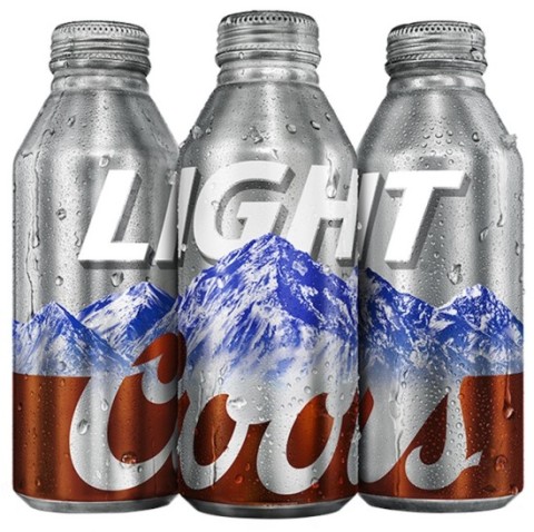
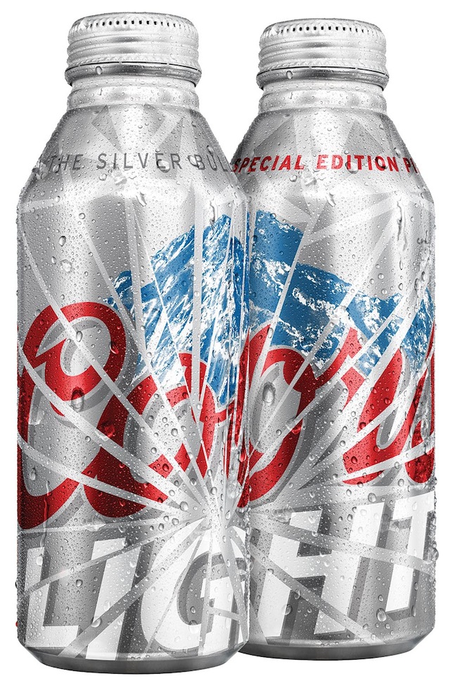
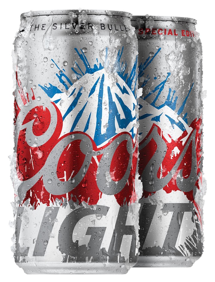
Coors Light 2014 Spring and Summer Packaging Designs
I was excited to be involved in the design development for the dynamic Coors Light spring and summer packaging designs. We developed a number of design solutions that were meant to show Coors Light in a new, refreshing way. After interviewing consumers, it was clear which designs rose to the top.
The spring “shatter” design represents the transition from winter to spring and breaking through the ice.
The summer design reminded people of good times with friends, summer holidays and refreshing Coors Light on a hot summer day.
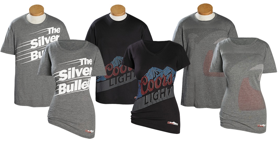
The new approach to design is being extended to other Coors Light items and the whole team is excited to unveil our new limited availability t-shirt designs, making their debut this summer.
Coors Light strives to be the design leader in the beer industry. It’s an exciting time for the brand and I can’t wait to see how people respond. Keep an eye out for these new designs over the next few months and let us know what you think in the comments below!