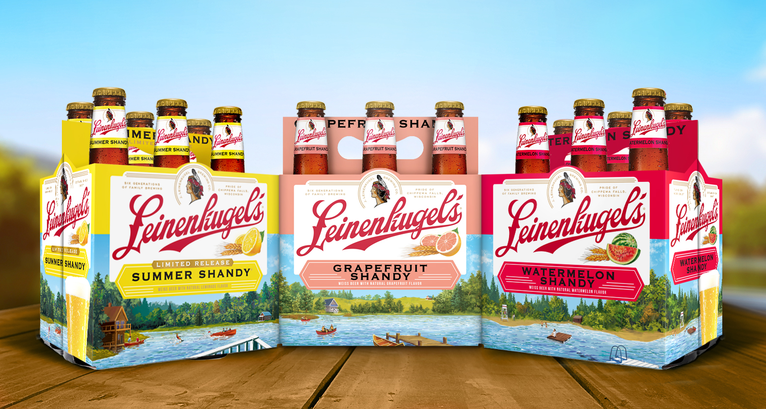
Earlier this year, Leinenkugel’s introduced its boldest packaging redesign – including for the phenomenon that is Summer Shandy – in a decade.
The new look is meant to highlight the Leinenkugel’s name, bring the Northwoods front and center, and more prominently differentiate the styles on the shelf.
Here are seven things you might not have noticed right away.
One. The landscapes of each brand provide different interpretations of the Leinie’s lake life. But each landscape has been crafted with a consistent horizon line to create a panoramic feel when multiple brands are lined up together.
Two. The white plaque is inspired by vintage Leinenkugel’s signs.
Three. Packaging for Leinie’s Creamy Dark and Anniversary Lager feature a bridge from the Chippewa Falls brewery.
Four. Most Leinie’s brands feature a blue sky – with two big exceptions. In keeping with their names, Sunset Wheat portrays a sunset while Creamy Dark depicts a nighttime scene.
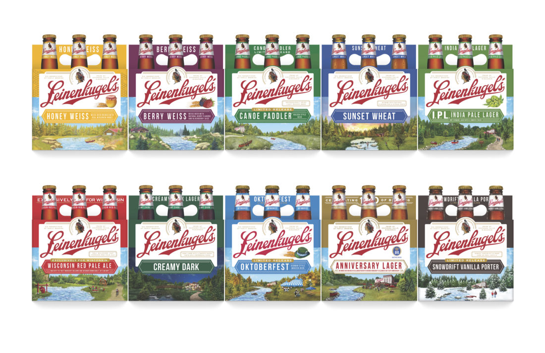 Five. A badger, the scrappy state animal of Wisconsin, can be spotted on packaging for Wisconsin Red Pale Ale. This beer is sold exclusively in the state of Wisconsin.
Six. The lakes and streams featured on all Leinie’s packaging are meant to represent Wisconsin lake life. The lake is inspired by Lake Wissota while the streams are based on Duncan Creek.
Seven. The original Summer Shandy label featured a water skier and a canoe. Water activities – skiing, fishing, paddle boarding, etc. – remain front and center (just as they do on the lakes in Wisconsin). And with the red canoe such an important part of the Leinie’s brand heritage, a canoe appears somewhere in almost every scene.