It's like when a friend gets a haircut.
Something looks different … but not that different. Just … better.
That’s exactly what we’re going for with Coors Light.
MillerCoors is rolling out new Coors Light logos, typefaces, imagery — the whole visual identity, as they say in marketing. We again teamed up with Turner Duckworth, the brilliant design agency that helped us take Miller Lite back to its original white label.
 We didn’t give Turner Duckworth many “musts” for redesigning the Coors Light look — they told us what makes it so good. They spent time in our company archives, and with our beer distributors and salespeople.
“Designers by nature are problem-solvers. One way they do this is by helping a brand rediscover what made it successful in the first place, and then simply find ways to present it back in a timely fashion,” says Gannon Jones, VP of brand marketing at MillerCoors.
“We maintained the classic Coors script — it’s a timeless mark that just required a bit of a face-lift.”
—Gannon Jones, VP of brand marketing at MillerCoors
So everything you love about Coors Light is still there — the Rocky Mountains, the red Coors script, the distinctive Silver Bullet. In fact, those elements are bolder than ever.
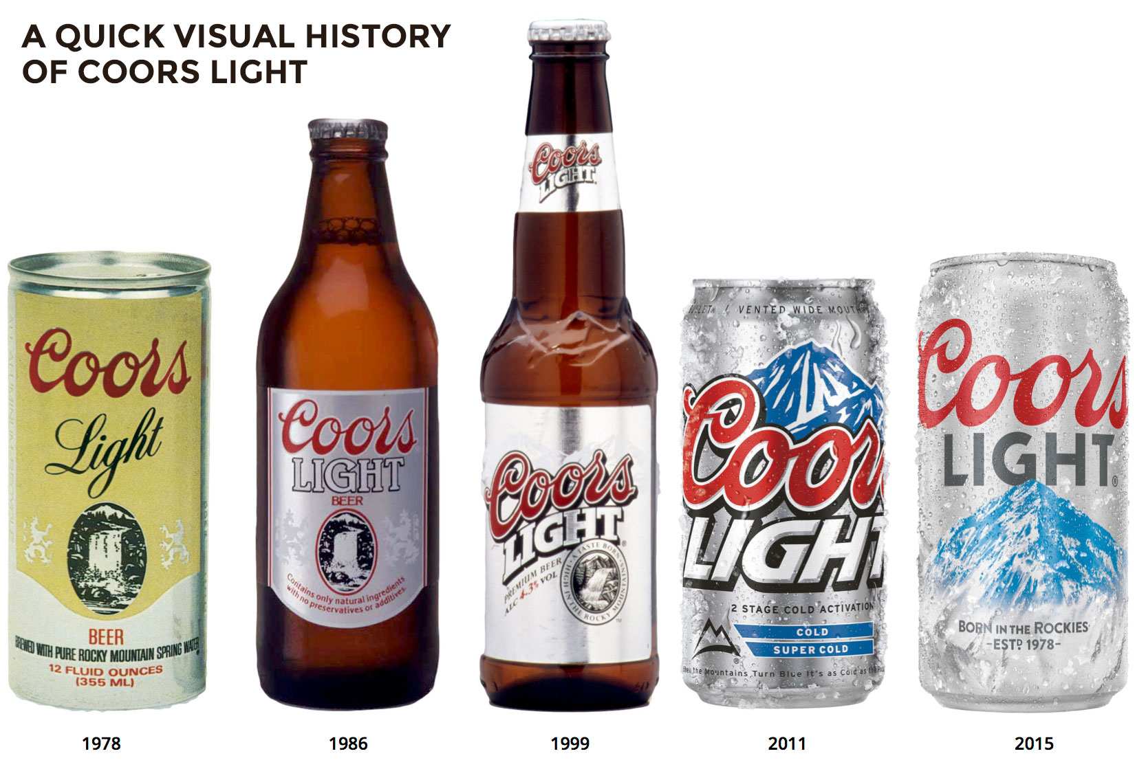
Let’s take a closer look at how Rocky Mountain Cold Refreshment got a little refresh of its own.
Logo lettering
A great haircut is exactly what happened to the words “Coors Light.”
We started by trimming the drop shadow from behind the letters.
“Drop shadows were very popular in the late ’90s. It added dimension and many brands started to use them,” Gannon says. “But today, their use cues a past era.”
There’s a practical reason, too, for dropping the drop shadow: smartphones. A streamlined logo just looks better on a 3-inch screen.
“We maintained the classic Coors script — it’s a timeless mark that just required a bit of a face-lift,” Gannon says. (We took a similar approach when we redesigned Miller Lite, shedding the shadow behind “Lite.”)
And in some uses, like on 12-packs and cases, you’ll see the red “Coors” cropped on either side — a move that indicates a confident brand not afraid to play with its logo.
 ‘The Silver Bullet’
This longtime nickname is a favorite of ours — and yours. And now it looks like Coors Light, with the word “Silver” in specially drawn Coors-like script.
“We felt strongly that this moniker was something we wanted to elevate — it’s a great handle for our brand that consumers love, and so you’ll see it play a more prominent role across our brand moving forward,” Gannon says.
Watch for the nickname to appear on the aluminum pint and packaging, and to be played up come football season.
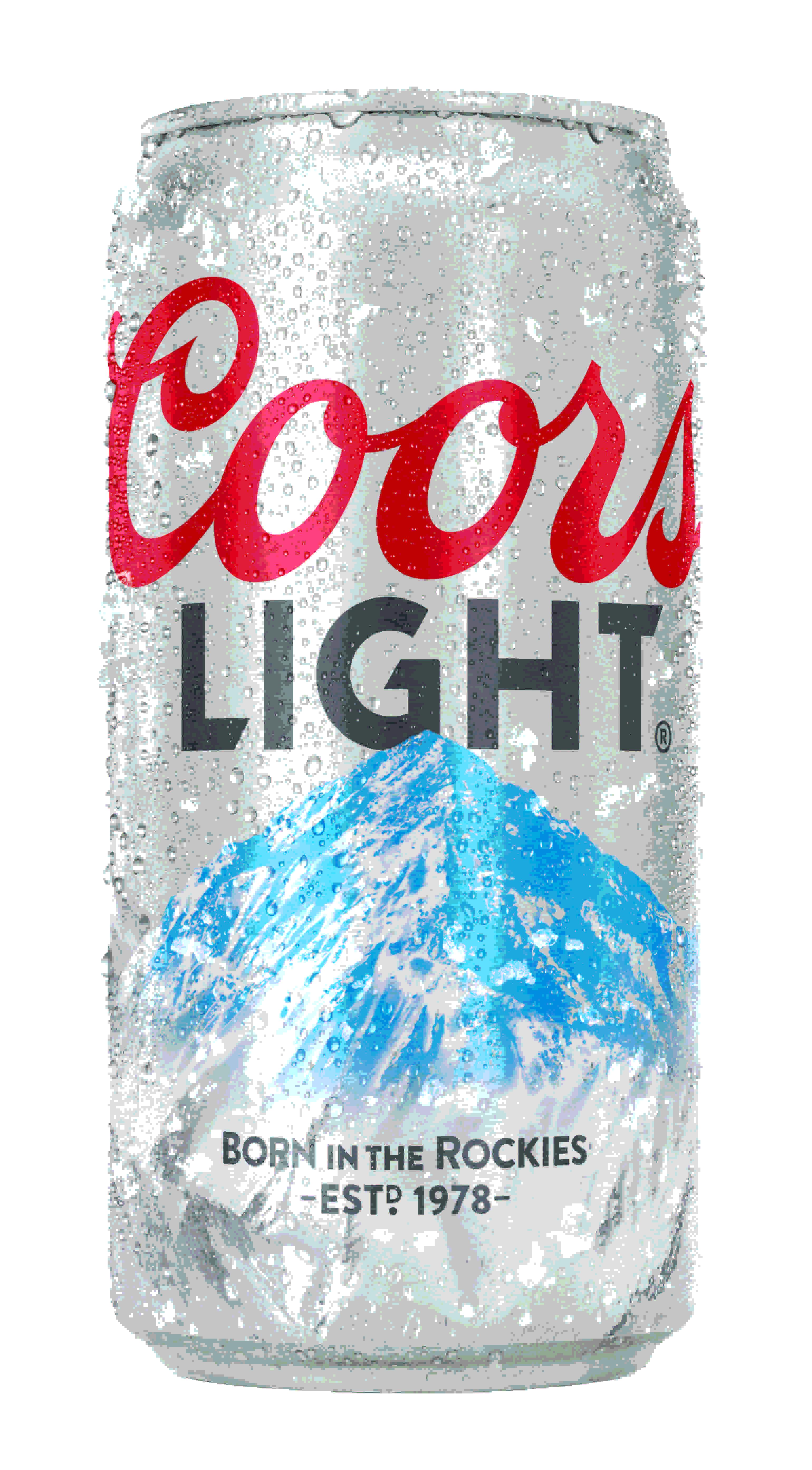
Can
The shiny silver can now has a modern matte finish.
“The frosted finish looks and feels cold, reinforcing our equity,” Gannon says.
The matte finish is also on new tap handles, which are made with recycled cans.
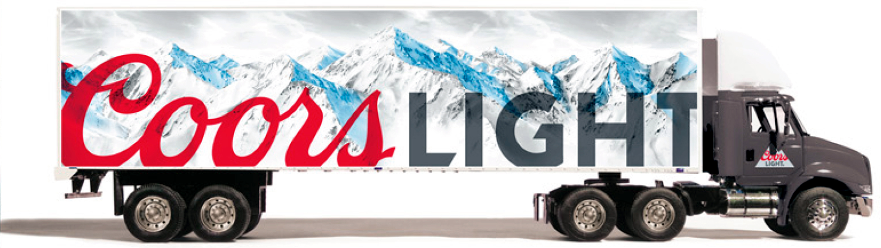
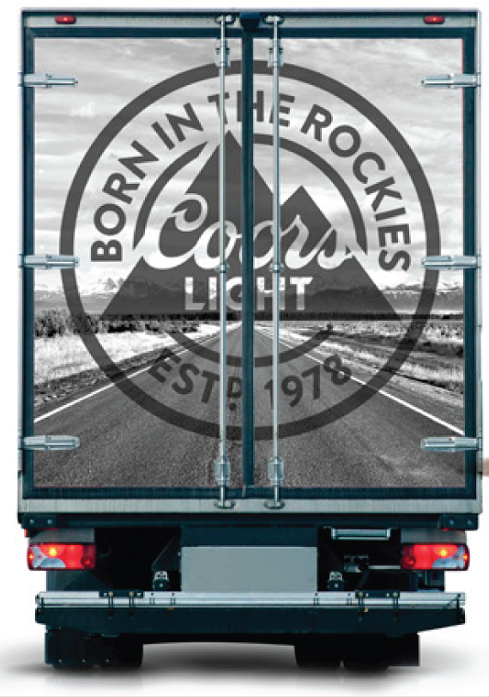
Rocky Mountains
 The Rockies will always be a part of Coors Light — that spirit of adventure is deep in the beer's DNA.
So we’re launching a bold “Born in the Rockies” symbol to represent the brand’s heritage in Colorado, a new mountain logo and a photorealistic image of our iconic mountain range.
And don’t worry, Coors Light is keeping the cold-activated cans and labels.
“When the mountains turn blue it’s as cold as the Rockies,” Gannon says. “That’s not changing."